Tuesday, October 23, 2012

Papertrey Ink October 2012 Blog Hop Challenge


Over at Papertrey, they are having their October Blog Hop with Christmas on their mind. 

They have all sorts of beautiful non-traditional color palettes to try out. I started with the color combo above,  but my ink pad of melon berry is really more a 'dirty pig' pink. (From what I've read, this color mismatch is one that in being addressed with the manufacturer.)

Here begins my adventure. I decided to replace the 'Melon Berry' with 'Autumn Rose'. Looked OK when I stamped a sample with the others using the  'Happy Harlequin' stamps, so I stamped in the background. NOT!!! Oh, my heavens. The 'Harvest Gold' looked like it had been through the washer too many times! What to do? I over stamped those diamonds with 'Ocean Tides' and the background seemed OK again, not
great, but passable. Now I had had a blue green and a blue pink with a yellow green and a yellow pink. I'm still not sure this color combo works, but it has grown on me - sort of like lichen. This for me, is part of Papertrey's magic - they make it all look so simple.

If I covered up my harlequin background, maybe I'd get away with my colors. I found a layout here at  Sept 2011 - Card Maps, that would help me, and the inspired poinsettia idea was Lizzie's. (If you haven't been to Becky Fleck's Page Maps, you are missing a major treat and resource!)

One last note - actually a question. I am using a laptop these days and I'm relatively new to it. I try to color correct my photos, but I can never tell if I get it right. Do you have any tips about how to standardize color adjustments with a screen that can be at any angle, and in any light, at the time I'm working? Your thoughts would be greatly appreciated.

Thanks for visiting today, and have a happy and creative Halloween.

Supplies are all Papertrey unless noted:
PAPER: vintage cream card stock, Paper Source's gold card stock
STAMPS & DIES: Happy Harlequin stamps and die,
INKS: spring moss, berry sorbet, harvest gold, autumn rose, ocean tides, VersaMark's 'Dazzle Watermark - Champagne'


Monday, August 27, 2012

Halloween Banner with a Vintage Touch

 One of my first love of blogs came from the visual feast of vintage images over at Karen's The Graphics Fairy. She is one of the most generous souls I've run across in blogdom, giving her readers one or two new vintage images a day......every day! It's never been easy for me to use vintage images in my crafts, but those images are invariably among my favorites - Halloween in particular. I have downloaded so many of her great images, that I finally screwed up my courage, and made a banner. (As it happens, only one of the images I used, a pretty witch, came from Karen's collection. Just search her blog for Halloween images though, and I bet you will have an instant need for all things Halloween.)

First, since the theme was an alphabet, of sorts, I went through my images looking for pics that could go with each letter, and then found adjectives that could alliterate with each. The letters I used were a no-brainer - the glorious alphabet was from Dover. (Sign up for Dover's great free images here.) The font is beautiful and is rendered in fall colors.


Next came the background patterned paper. Recollection Papers at Michaels provided a set of fall hued backgrounds of the same pattern, helping me create a cohesive look throughout when combined with the fonts. At this stage I started becoming overwhelmed with managing the elements. Then, inspiration hit!

I had used Microsoft's 'Publisher' for other kinds of projects, and I think it is the most intuitive and easily used of all their programs. It handles pictures, cropping, resizing, and text beautifully. Your layout can be tweaked until it is just perfect, and nothing has been 'glue-committed'. (You can even select your layered art and save it as a flat picture to use elsewhere.) This method has liberated the way I think about composing my collages.

 Once I had the banner fixed, I copied all the separate images needed, on to new pages in the same document. Just these pages were then printed, cut out, and assembled on 4.5"X 6.5" DCWV black chipboard. Buttons, glitter, ultra thick clear embossing powder on the letters, and scrapbook embellishments, finished the look. The panels are held together with two short lengths of ribbon hot glued at the top and bottom on the backs to act as hinges.

This new way of working has absolutely liberated me from my novice hangups. It has proved to be so much fun, that I am now working on an entire Halloween alphabet collage, and a Christmas banner much like this one. If you have any questions concerning about how to use this method, I would be happy to answer your questions.

Thank you so much for taking the time to look at this. I would love for you to leave a comment, especially so I will know if this is something that interests you too, and something I should share in the future.

Happy Halloween, or at least the thought of cooler weather!

Wednesday, July 25, 2012

Papertrey's July Blog Hop

The color palette for the blog hop over at Papertrey is divine. I don't know about other people's experience, but I find PTI's colors to be more WOW! in person, than on my computer screen. This challenge left me thinking there was nothing that couldn't be accomplished if I just used wonderful 'Summer Sunrise' ink.                                                                        I just went for two tags. Tags are small experiments I can handle. For both tags I mixed and matched sets. The pinks and yellows reminded me of a 'gold flame' honeysuckle in my backyard. 'Mat Stack 5 provided the die-cut and most of the stamps. I used one half of a ornament stamp from the set to make the leaves, and for the stem, the dashed stitches from button boutique. 'Happy Birthday to you!' is from Flower Fusion #9 done with StazOn 'Timber Brown' because black was too severe for the palette I thought.

The second tag I'm not so happy with, but I just can't put my finger on why. I tried after the fact watermarking with VersaMark 'Dazzle Champagne' to give a bit more interest...toooo subtle. There was a discovery though; watermark ink on dye ink will slightly deepen to hue, just as it does on colored paper. All except the Happy Birthday stamp (from 'Happy Day'), the images are from 'Iconic Images', one of my go to sets. The die is 'Mat Stack 3'. A little DecoArt 'Glamour Dust' and glue pen were used to finish off the pair.

Friday, July 6, 2012

New Home Card

Houses have always been a love affair for me. When I was just four or five years old, I would beg my parents to drive through certain neighborhoods in Cincinnati, where the houses had that 'storybook quality'. Many were half timbered and/or stuccoed. (There are not as many of these abodes outside of Boston where I live now, and I miss them.)

The very first house stamp set I bought was 'Home Sweet Home' by Crafty Secrets. I love the images  and use them for holiday and new-home cards. This set is one of my favorites and I never tire of the different ways it may be rendered.

One technique that works particularly well with Clear Art Stamps's  designs is outlining. The image is stamped in a faded black, grey or brown (dye ink only), and then the lines are drawn over in a bolder hue of the  colors I wish to make each area. I use my set of fine-point 'Sharpie' markers on the outlines, and fill in the centers with a lighter version of the same color, but in colored pencil.

 DISCLAIMER
 At the time I made this card, I could not get a good light image from the inks I had. Usually this works by stamping off lightly once, and then repeating the stamp on the paper you'll be coloring on. I still wanted to use this technique, so I scanned my stamped image and then printed it out on draft. (You can see some pixelation (not the storybook kind) in this image.)


For the card I used a Brenda Walton card from 'Postmarks' and recut the hole with my Labels Two Nestabilities set. I Cut the border to the window with the same size die and then again with the next size larger, and finished by running it through my Cuttlebug embossing folder.

Please leave me a comment and tell me if you like (or don't like) this technique.

Supplies: Crafty Secrets 'Clear Art Stamps' set 'Home Sweet Home', K and Co card by Brenda Walton, Papertrey Picket Fence Die, Cornish Farm (defunct) running rabbit stamp, Cuttlebug 'Birds and Swirls' embossing folder, white Prismacolor pencil, gold 'Liquid Pearls', and misc paper flowers and brad.

Tuesday, June 26, 2012

Dogs need party hats too!


Well, it's been a dog's age since I posted, and when I think of all that has passed in the last few months, its mind boggling.

 After several scares and hospital visits this spring, my near 90ish parents are getting back to life as they know it. (Have you noticed how gutsy are elders must be just to get through life these days? I wear out living their lives one day every now and then, and they are, doing it 24/7. Just when it would be nice to rest, life becomes infinitely more difficult.)

Interleaved with some chaos, my family just finished up our birthday season. It starts with Mother's Day, and ends with Father's day. In between we squeeze six birthdays - every member of my husband's and my family! We all become a little party boggled.

In honor of our birthdays, our 'holiday mantle' was decorated with birthday dogs. (Until recently, we always had a family dog, who was shared by all.) Adding pups to my mother's childhood collection of metal and china dogs, has given me a great selection of canines to decorate for various occasions. You can see the final effect in my current blog header.

WARNING: THE FOLLOWING PARTY HAT DIRECTIONS COULD BECOME ADDICTIVE!

I discovered a very easy and fun way to make small party hats. Using my 'Big Shot' and Nestibilitie's circle dies (the ones with scallops would be cute too), I die cut my paper and then made a straight cut from the perimeter to the center with scissors. HINT: Because of the small size, lighter weight papers are a whole lot easier to fold around and keep glued together. Fold the circle around it's center point until you like the look, and cut off the extra,leaving enough overlap to glue well. DO NOT GLUE JUST YET!

Now for the real fun - the hat's topknot!  Take a healthy length  (at least 10") of yarn, twine, or ribbon that will be in the hat topper. (Now's the time to use all those little bits and pieces of fiber that were too nifty to throw away.)  Wrap all the topknots' fibers around two or three fingers, pull the yarn you first cut through the fiber doughnut you just wound, and tie snugly when you reach the middle of that length.

Fluff out your pom-pom, and place the knot in the middle of your cut circle. Roll the circle around, making sure the pom-pom can not slip through the hat's peak. Glue or tape  into place. (I used score tape to make sure the hats did not 'unwind') That long yarn is now the hat's ties. You can also pin the hat on, or make small holes in the brim and attach ties. Your dogs are now ready for play without fear of losing their party hats.

I hope you try this and have as much fun as I did! I'd love to see pics of your party pups. Thanks so much for visiting. Please leave a comment if you enjoyed this post.


Thursday, April 26, 2012

Does My Blog Still Hop if I'm a Day Late?

Well, here I am just having missed Papertrey's April Blog Hop. My very dear friend Liz comes to my nest on Wednesdays, and we make cards together, and TALK about everything! Lately though, we've missed all but one Wednesday of merry making in the last two months. There was just way too much catching up (including talking about our favorite blog {capture the moment}, so we were late to post...as in a day late.

We learned a great deal from our card making though. Until Liz and I started entering 'hops' and 'challenges', our design furrows were well enough dug, that just like a good pot-hole, we didn't know we were in one until we got out. (If your not from a northern state, pot-holes are irregular shaped abysses in the street that will easily seat 100 or more people. When it rains, think swimming pool with an inconvenient location.)

Liz's cheery card is a get well for a friend who just had brain surgery. Sounds harrowing, doesn't it? Sometimes medicine seems to mess up life as much as it helps, but in this case, medicine 'rocks'! Nancy had increasing difficulties finding words and reading; it was really beginning to interfere with her enjoyment of life. In the morning, Nancy had a cyst removed from her brain and fluid drained, and by dinner time that evening, we talked on the phone with nary a missed word. My friend didn't even have a good headache to show for her trials. It truly is a miracle to have help that can make such a difference in the quality of our lives.

Back to Liz's card (the one beeing held), all but the polka dots are from Papertrey's Mat Stack 5 stamp set and die.

I just received my first Papertrey dye stamp pads. I love the colors and even the look of less-than-perfect coverage on clear stamps. For the challenge, I decided to create patterns by stamping off, stamping over, and keeping the pinks, blues and greens 'segregated'. Using several different stamp sets to make the textile-like patterns was a hoot. I toyed with adding a little brown trunk to the tree tops (oh, that's what those round balls at the bottom are!), and using an other color for the 'fly away with me'. (I needed to darken the 'fly' with a pen so it could be seen.) What would you have done? Please leave me a comment so I can learn from all you great artists out there.

The dye inks are a revelation to me. They allow for so much depth and layering I just haven't been able to achieve with pigments and chalks. I cheated and used Mehndi Medallions (not a dot, flower or damask) for two of the trees. The mid size medallion  fits exactly on the tree tops, but my favorite look was using a part of the largest medallion on the middle tree.

If you leave Liz and me a comment, we'll hop over to your blog and see what you are up to. Thanks for visiting!

Papertrey Supplies (for my card): Up, Up & Away Stamp Set, Mega Mehndi Medallion, Trendy Tree Tops Die Collection, Heart Prints Stamp Set, Beautiful Butterflies Stamp Set, Beautiful Butterflies Die Set, Guide Lines Two Stamp Set, Iconic Images Stamp Set (special set no longer available), Flower Fusion #7 Mini Stamp Set, Flower Fusion #9 Mini Stamp Set, Hibiscus Burst Ink, Aqua Mist Ink, Berry Sorbet Ink, New Leaf Ink
Other Supplies: Tumbled Glass Ink - Tim Holtz, Swirls - Autumn Leaves Clear Stamps

Wednesday, March 28, 2012

Easter Eggs on Fabric Postcards

Nothing gets me in the mood for lots of color and reflected light like Spring. For the past couple of years I've made fabric postcards of fabric colored eggs with sequined, beaded and embroidered details. If you're not familiar with fabric postcards, they are usually 4"X6" mini quilts with a middle layer of stiff material (like Timtex or thick Pellon) as the 'batting'. The very stiff surface allows marvelous detail to be applied without worrying about keeping the fabric taught.  Rumor has it that they can be mailed, but I've never put mine to the test.
 Above are three postcards in various stages of the process. I chose three fabrics that worked together for the egg image, and then cut through all three layers of fabric so I could mix and match. (I love having three slightly different 'canvases' on which to work because I can try out different approaches in the same color scheme. The far left card just has the background and egg image fussed (I use 'Heat n Bond') on one side.

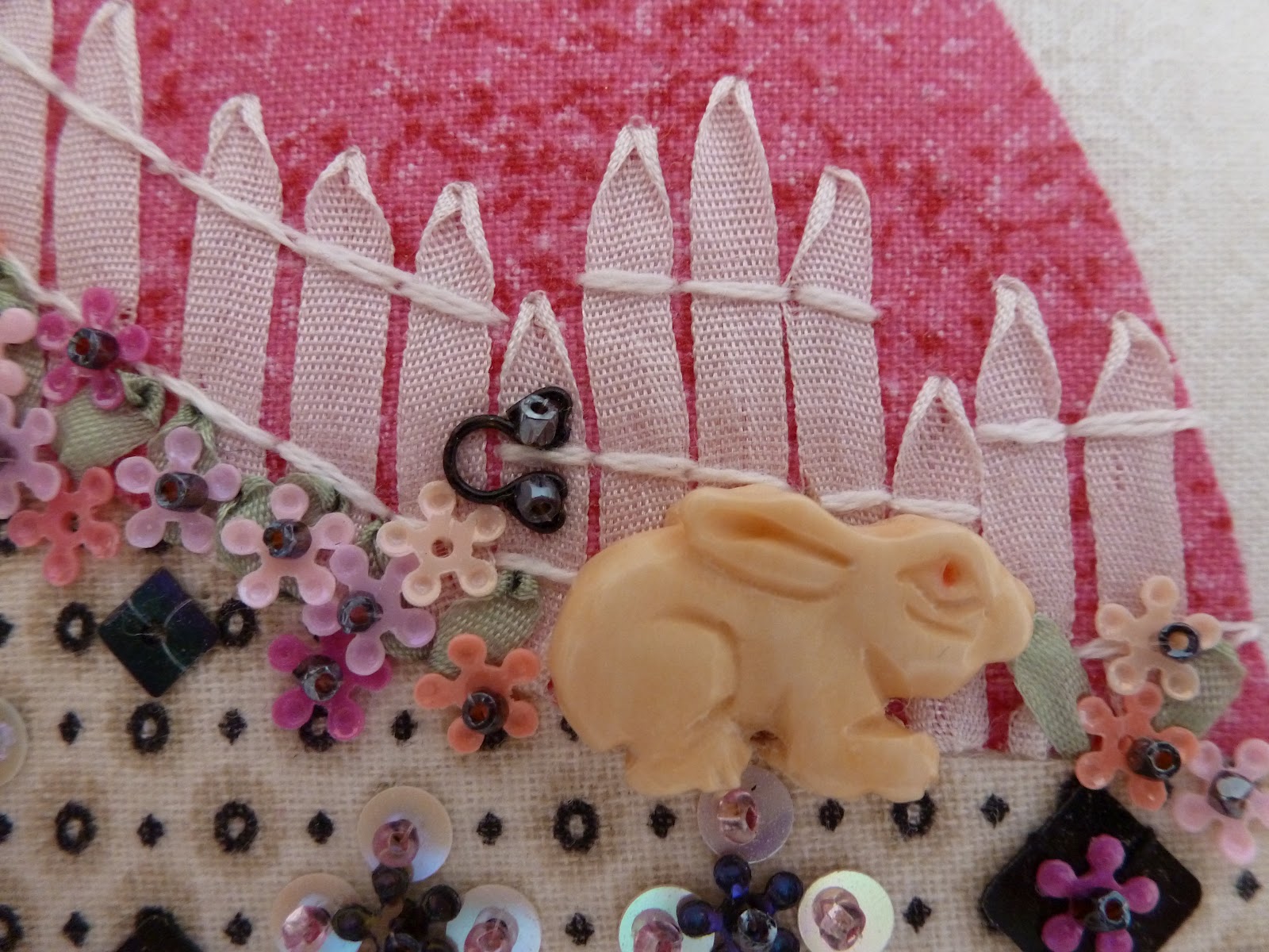
The middle postcard is finished on the front with everything but some detailing on the background. I tried to use the embellishments to transition between the three fabrics comprising the egg. The wonderful sequins come from Cartwright's Sequins, Beads, Buttons, and Glitter. I stumbled on to her site many years ago when she first started online. Since then, Cartwright's has grown to be the largest selection of sequins I've seen anywhere. If you love hand sewing with beads and sequins, or use glitter, you owe yourself a trip to her site!
A little ribbon embroidery makes the fence and the butterfly, and that gate handle is the smallest eye (from a hook and eye closure) I could find. The fabulous bunny is a hand carved bone bead from China.

 The card to the left is finished. After embellishing the front, I iron fabric to the backside, with the front side placed on a deep soft surface so the sequins and other fragile items are not crushed by the heat and pressure. To bind the postcard, polka-dot grosgrain was folded over the edge and whipped down with a blanket stitch.

Voila! You now have a bit of art to send through the mail, or if you aren't finished admiring your handy work yet, put your eggs in a basket and watch people marvel as they pick up your 'Faberge' eggs.
Related Posts Plugin for WordPress, Blogger...